Saturday, 17 November 2012

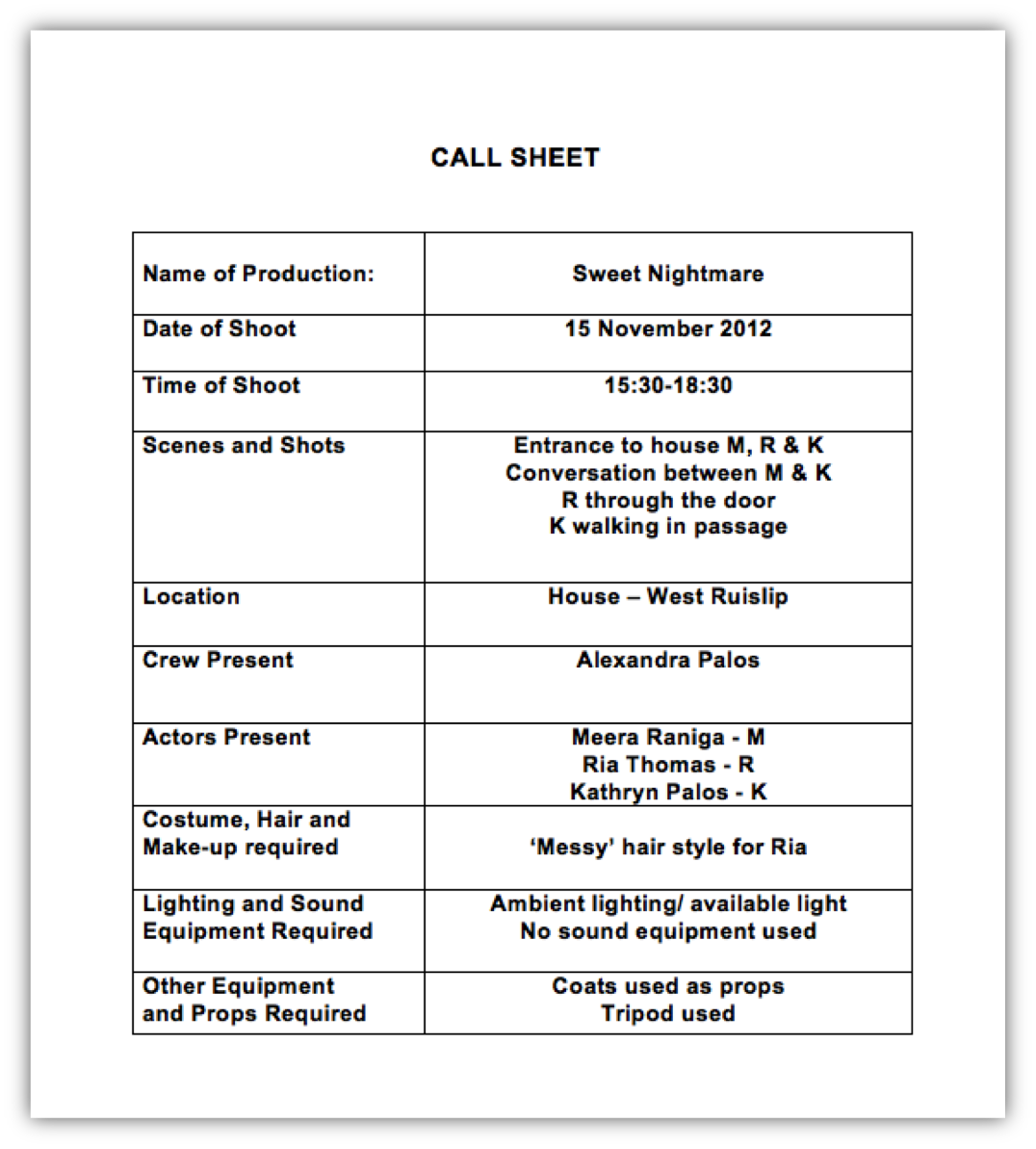
Call Sheet 1

We were advised to use call sheets to ensure we were organised and had everything we needed for each scene. At first I thought the call sheets would not be useful but in the end it allowed me to plan how long it would take to film- which proved to be beneficial as I now had a rough idea of when I would be finished filming.


Monday, 12 November 2012

Further ideas on my narrative

I presented my original idea of the couple in the forest with the dog and the step sister idea- here is some of the feedback I received:

"They both sound pretty good.. I like the second one a bit more as i think the story line seems a bit more clever- like the audience are going to have to try and work out the mystery or try and keep up with the story, so they get involved. Whereas the first one seems a bit more basic, good, but as a member of the audience you won't have to be kept on your toes (if you know what i mean).

Maybe in the second one, the mum or dad could think the step sisters are not trying to get her into trouble and it is her being bad because she is jealous that she doesn't see the mum or dad or something then she has  to try and convince him or her that is wasn't her who killed the step-sisters.." - Zoe

Target Audience member feedback - Zoe


I asked a member of the target audience- Zoe, to watch two trailers :Grave Encounters and The Uninvited - and highlight key parts that she thought were important.


The Uninvited

"Opening title part that is yellow - It flashed up quite quickly so I didn’t really take much notice of it. The high pitch ‘ting’ sounds throughout is quite eerie and even though it doesn’t seem to speed up like in most horror trailers, it still makes it feel tense. At first I thought the guy in the car was going to be the bad one, so I was a bit like ‘noo! Don’t get in the car’ but then he was nice to her, so I trusted his character and felt sorry for him because his parents were killed. There was like lightning, which made it scary because it was like a power cut and bad stuff can happen in the dark. The conversation with the mother adds a mystery to the trailer, why does that house allow them to live in theirs? The fast editing and reflection of woods don’t  really to trailer. Lamp being knocked over, made be jump, and wonder why the girl just walked straight into it. You can tell there’s something wrong with her. The round the table made the trailer seem a bit happier, but then you hear their conversation and it gets scary again. Newspaper fade into police security line, you see the girls name and then the police scene, you know she had something to do with it and it makes it seem scarier. The light going on was a bit scary, it made me wonder who was in the house. The fact she didn’t want the daughter alone in the house with him, made me a bit suspicious of him, could he actually be a bad guy? The daughter and guy on the sofa is breaking mothers rules, something bad always happens when you don’t listen to you mum! The carpet moving by itself was very tense, I wanted to warn the boy and girl that there was something in the room with them. Girl coming out of floor and couple continue, made it tense, again I wanted to warn the couple, starts to make my eyes squint because I think something is going to happen. Spiders running on old wall paper was creepy, especially because I hate spiders :L The phone made me scared that something had happened to her."


Gothika

"The opening ‘Darclight’ fits in well with the horror, the way the light moved was like a torch searching for something.
 Editing was smooth and as the trailer went on switching between scenes seemed to speed up, like heart rate did. Most of it did look realistic, but at the very end when the girls mouth turned black and opened wide didn’t look that realistic.
 I liked the way the trailer was jumpy, and the bit at the end, when you think it’s over but then another loud jumpy bit happens. And I like the fact they tried to make it seem like something that really happened, when it said the footage remained hidden from the public for over 6 years – makes it seem all official. 
Story line was pretty good, it didn’t seem like a copy of another horror film.
 I thought the actors were good, I actually believed they were scared too. But lady at the end screams to much (haha).
  The archive footage was effective, it was quite eerie. Sound was good, the music was quite tense at the beginning making it more scary.

The parts with writing were also good, they added essential information to the story line, and the font they are in suits the horror theme.
The costume/clothes they wore seem like something I would wear to visit an old hospital place, and the patients are also wearing suitable costumes for being mental patients. The location looked quite scary, like what I would imagine an abandoned mental hospital to look like. The girl screaming at first it is scary, but I think she screams for too long and the fear wears off."


Zoe's feedback proved helpful as I gained an insight into what a true horror movie fan likes to see in movies / trailers. I found that the key to a good trailer is having good actors so made this my priority to get the best actors who were available.


Movie magazine front covers analysis

I wanted to explore whether it a masthead could last a number of years without changing drastically and to see if I would be influenced by the outcome. 'Empire' has indeed successfully kept a similar font.  The consistency of the masthead over the years has helped to secure the brand identity of the magazine. It is quite common for mastheads to more or less stay the same in appearance over the years, while the rest of the front cover experience changes. 

The two editions of the same magazine are similar despite being published within a few years of each other. The magazine focuses on all movies rather than just horror movies- as horror movie fans tend to be a smaller target audience rather than movie fans of all genres in general.


This cover follows conventions of magazine covers as it includes a masthead and sell line as well as a strap line and a banner. The older issue does not include a banner or strap line however and places most of its sell lines in the left hand third where the human eye is drawn to first. The newer issue has the main characters from the movies that the magazine is primarily focusing on this issue, in front of the masthead- as the magazine is well enough established to be able to do so. Audiences will be able to identify the brand even if some of it is covered or blocked. Meanwhile the older issue has the character placed be hide the masthead which suggests that the magazine was not as established as it is now.

The font and size of the masthead have not changed much throughout the years, which is possibly why it is so well recognised today. The font is simple and easy to read from far away so is ideal for advertising.


The newer issue has a lot more colour on it- for example the fire in the background and the banner containing various movies as well. Compared to the older issue which has three main colours, black, red and white. Some prefer the older issue as it is more representative of the horror genre- and in this issue it focuses on horror movies referring to multiple movies in the sell lines 'Catering for cannibals' and 'Are you psycho?'.

The newer issue also has its characters standing tall and powerful and looking determined and reading to battle against evil, while the older issue is more creepy and frightening. It can be said that the close up of the main actor on the older issue is  more representative of the horror movie genre, rather than a range genres of movies which 'Empire' magazine focuses on.


After doing this research I have a better understanding of how a magazine can keep its masthead in a similar style but each copy of the magazine can be focused on different genres. This has provided me with the knowledge that if my magazine was as successful as 'Empire' magazine then I would be able to focus on certain genres such as horror- as 'Empire' and other movie magazines have done in the past.

Initial Make-Up and Costume ideas

The image below reminded me of a vampire, although vampires or 'creatures' will not be involved in my movie and therefore trailer. Using make-up like this may provoke the audience and make them wonder whether the character is a vampire or 'creature' or more of a disguise.


In the teenage movie 'Twilight' a close up of the main character's lips, which were chapped and dry. This allowed the audience to view the actress as less glamourous and more 'normal'. I am considering using a similar close up shot either of my actress's lips or eyes to immitate the similar 'Twilight' footage.

Instead of having the main character being natural through-out the entire trailer or movie, I am considering having a moment where the audience see the bad or evil side to her personality- almost like  the 'Jeckle and Hyde' story. Here are some costume ideas, that will make her look sophisticated as opposed to plain and ordinary girl.


Magazine front cover analysis 1 - Fangoria


This magazine is deadicated to horror movies. The masthead and type of font that is used, is the first thing that allows the audience to make this connection. The colours used are red, black and blue which is common among horror movie posters and magazine covers.

The masthead can be disected into, 'fan of gore', however 'Fangoria' makes the magazine sound more mysterious and reminds the audience of vampires- which are associated with horror movies. The name can also suggest that 'gorier' films feature in this film. The font is shaped to replicate the shape of vampires teeth, while being coloured red reinforces the idea of blood and death. The shape of the masthead, especially the 'F' and 'A' frames the image and seems to point towards the image drawing attention to it. Thus also making her red eyes and red lips stand out more. The main character - who the audience assume to be Natalie Portman-is wearing so much make-up and is heavily edited so seems more like a creature rather than a human being- which is what the movie is all about. Natalie Portman plays the role of a ballerina, who gets to dance the main role in swan lake. The director wants her to have more 'sex appeal' and Natalie Portman's character is not entirely comfortable with this. Her character starts to be more confident, shuts her mother out of her life and self-harms in the form of scratching herself. The marks left by the scratching turn into raised bumps and at the end of the movie the audience see that feathers were 'sprouting' out of her back. As the audience see the feathers surfacing they predict that she is a creature as no human has feathers. The character seems to have a mental illness of some sort and starts having illusions and hallucinations. She becomes obsessed with her dancing role and transforms mentally and physically into the dancer's part she is playing.

-Please see below for example


The strapline above the masthead reads ''Darren Aronofsky's dance of death''- this links to the whole storyline of 'Black Swan' which also focuses on the psychological being of the main character. The strapline also links to the topic of death to dance, which reminds the audience that 'Black Swan' is not a typical film about ballet, rather a deadly and dark thriller.


The make-up makes the character abnormally pale, and the audience can only tell that she is human by the faint small amount of hair we can see- which suggests that the character that the ballet dancer is playing has overtaken her personality. The eye make up resembles a swans wings however as they are dark it goes against the idea that white swans are pure and innocent- which implies that the actress was pure but has been englufed by the character she is playing and has become evil. Again the idea of good versus evil is brought into consideration, especially since the rest of her face is so pale contrasting with the dark eye make-up. The idea of her character now being evil is reinforced by her eyes being so red- which could be linked to the devil. Despite the darkness and evil suggested by the make-up, the character remains extremely beautiful. This of course, links to swans, as they are seen as exceptionally beautiful creatures. It could also be said to pay homage to horror tradition and the deadly female characters that used beauty to ensnare their victims.

The other 'sell-lines' or rather names of other films, are incredibly simple. This allows the audience to focus on the main image and for the main image and sell-line to dominate the cover of the magazine even more.

The movies name 'Black Swan' appears near the bottom half of the magazine and is in red, upper case font. Red is usually associated with love and passion or the devil, hell and evil- in this case the latter is what we associate all of the red imagery with. There is not a main sell line- althoug it can be argued that 'Black Swan' is in place of the main sell-line, and those that have seen the trailer or the movie, or even the poster will be enticed to buy the magazine. Smaller 'sell-lines' or stories are either side of the main image, and are coloured black, red and blue- which reflects the make-up used on the main characters face. Having sell-lines placed either side of the magazine cover is an unusual convention as many magazines focus their most important sell-lines on the left hand third. Sell-lines appearing on both sides of the main image will allow the target audience to spot that this is a film magazine easily without searching through the array of other magazines.

As this magazine focuses on horror movies in particular it seems unconventional to use a plain white background on the cover of the magazine. Most people associate the colour white with being pure and innocent- a large contrast to the articles and features contained in this magazine. However having a white background allows the image of Natalie Portman to stand out extremely well and make a large impact on the audience.

A banner is employed at the bottom of the magazine cover and contains four different stills from different horror movies. Each image is of a slightly different horror sub-genre, e.g. the image with blood on the persons face indicates that, that movie is of the slasher sub-genre. Using an image of a film reel allows the target audience to realise more easily that this is a movie magazine. Regular readers of the magazine, who may not be huge fans of 'Black Swan' will have knowledge that they have a range of sub-genres to read about- just by glancing at the film reel.